SharePoint Intranet

Websites

Looking for a SharePoint design example to help you envision your future intranet?
SharePoint is one of the most widely used solutions for building corporate intranets. Part of Microsoft 365, it brings together news, documents, applications and essential employee services in one place.
But a SharePoint intranet doesn’t have to look like a standard SharePoint site.
With thoughtful design, UX and customization, SharePoint can become a modern digital portal that fully reflects your company’s visual identity.
An editorial homepage, custom navigation, eye-catching highlights, news, videos, an employee directory, applications, events and targeted content can all transform the employee experience.
At Studionet, we have been designing custom SharePoint intranets for large companies and organizations for many years.
Here are 10 SharePoint design examples that showcase what the platform can offer.
Good SharePoint design goes beyond changing colors or adding the company logo.
Above all, an intranet’s design should help employees quickly find the information they need while encouraging them to visit the portal regularly.
It generally brings together several complementary elements.
The first is, of course, visual identity. The intranet should reflect the company’s brand through its colors, typography, icons, photography and editorial style.
The second is information architecture. Content should be organized so that the most important information is immediately recognizable.
The design should also make navigation easy. Applications, documents, internal services and news should all be accessible in just a few clicks.
Finally, good SharePoint design should work equally well on a large monitor, a laptop or a smartphone.
The goal is to strike the right balance between:
A successful intranet feels like a cohesive digital experience, designed specifically for the company’s employees.
Every company has its own needs, visual identity and way of communicating.
There is no single approach to SharePoint design.
These examples show how the platform can be adapted to a wide range of visual styles and uses.
For a brand with a distinctive visual identity, the intranet should reflect that identity from the very first visit to the homepage.
Large photographs, videos and editorial layouts can create a far more immersive experience than a traditional SharePoint portal.
For L’Occitane, the aim is to deliver a strong visual experience as soon as employees enter the portal, giving prominence to both the content and the brand’s identity.
Full-screen video, for example, can make the homepage particularly immersive.
This example shows how a SharePoint intranet can become a powerful tool for brand communication while retaining the benefits of Microsoft 365.

In large organizations, design goes beyond aesthetics.
It also needs to organize large volumes of information, services and content while keeping the employee experience simple.
For France Télévisions, the intranet architecture consists of a hub and numerous associated SharePoint sites.
The design must therefore provide a consistent visual identity while allowing different departments and teams to have their own spaces.
Several page templates can be used: department homepages, news pages, employee directories, applications, documents and editorial pages.
This example highlights the importance of a consistent SharePoint design system that works across dozens of sites while maintaining a unified experience.

An intranet’s design can become a natural extension of the company’s digital identity.
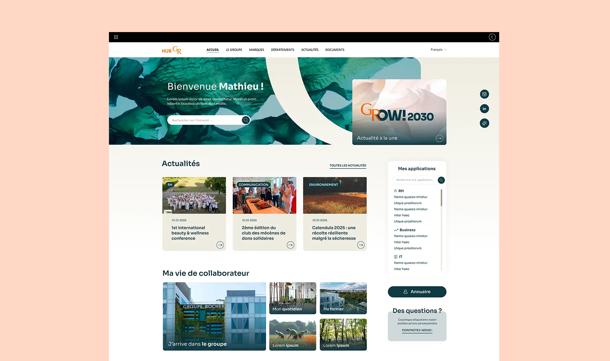
For Groupe Rocher and the Yves Rocher brand, the aim is to deliver an experience that is modern, accessible and consistent with a highly recognizable brand identity.
Colors, imagery, white space and content hierarchy help create an intranet with a stronger editorial feel than standard SharePoint interfaces.
This approach also encourages employees to embrace the portal.
The intranet becomes more than another IT tool: it becomes a true internal communications channel.
For some companies, the intranet is primarily an internal communications channel.
In this case, the design should make news easy to discover and encourage employees to check it regularly.
For Groupe Etam, the homepage can feature visual formats such as news sliders, editorial highlights and content blocks that draw attention to important information.
This makes the content feel much more dynamic.
Employees can quickly find the latest news, events and strategic company updates.
This type of design transforms SharePoint into a true internal publishing platform.

In a large group, employees often have access to a wide range of resources: applications, news, documents, HR services, internal communications and business tools.
The intranet’s design should make this environment easier to navigate.
A SharePoint homepage can combine several layers of information:
priority updates, news, quick links to key applications and dedicated areas for accessing the company’s various resources.
The role of design is to make this wealth of functionality simple and intuitive to use.
Careful attention to icons, cards, menus and visual hierarchy helps guide users naturally.

Organizations with a wide range of roles and departments often need to bring very different types of content together within a single intranet.
The design should therefore prioritize clarity and structure.
A homepage can be organized around key topics, complemented by news, important documents and direct links to essential services.
Visual components help avoid the “list of links” feel still found on some intranets.
Colors, illustrations and icons make the different areas easy to identify at a glance.
The result is a SharePoint intranet that is more accessible and more enjoyable to use every day.

For a group like Cerba Healthcare, the intranet needs to serve different employee groups and roles while maintaining a shared approach to communication.
Design can play an important role in establishing a clear information hierarchy.
News can be highlighted through visual cards, categories and filters that help employees quickly find topics relevant to them.
Search features can also be incorporated into the design to make content easier to discover.
A consistent interface brings together corporate communications and role-specific information while keeping the intranet simple to use.

Intranet design is about more than the people who browse it.
It should also help communications teams publish and update their content easily.
For Car Avenue, a key objective is to give contributors a clear interface and reusable components.
They can then create new pages that automatically follow the intranet’s visual guidelines.
This approach helps maintain a consistent design over time.
The company also gains greater autonomy, without needing technical support for every content update.

For an institutional organization, design often needs to balance simplicity, modernity and easy access to information.
The intranet can bring together different types of content: news, projects, documents, internal resources and practical information.
Consistent visual components help organize this content without overcrowding the pages.
Cards, visual blocks and clear heading levels make content much easier to scan and read.
An understated design does not have to be minimalist: it can offer a rich interface while remaining clear and readable.

A modern intranet should do more than display content.
It should also give employees quick access to the people, applications and services they need.
For Monnoyeur, integrating an employee directory connected to Azure AD allows users to search for colleagues directly from the intranet.
This type of feature can be fully integrated into the platform’s design.
Search, photos, job titles, contact details and additional information can all appear in an interface that is consistent with the rest of the portal.
This example illustrates an important shift in SharePoint intranets: they are evolving into comprehensive digital workplaces that bring content and services together.

SharePoint offers several built-in options for customizing a site’s appearance.
You can change the theme, colors, logo, navigation and certain aspects of the page layout.
Standard web parts also make it relatively easy to build a homepage featuring news, quick links, documents and events.
For some projects, these native features are all you need.
They allow you to quickly create a functional intranet that stays entirely within the Microsoft ecosystem.
However, these options become more limited when a company wants to precisely reflect its visual identity or create an experience that goes beyond traditional SharePoint templates.
Custom SharePoint design opens up many more possibilities.
For example, you can customize:
The difference goes beyond appearance.
Custom design also lets you build a user experience tailored to how your company actually works.
SharePoint offers far more customization options than many people realize.
The platform can provide the technical foundation while allowing considerable freedom in interface design.
With the SharePoint Framework, for example, you can develop custom components and integrate them directly into SharePoint pages.
These components can use data stored in Microsoft 365 while offering a fully customized interface.
This makes it possible to create designs that look very different from SharePoint’s native appearance.
Pages can feature custom content grids, large images, videos, animations, interactive maps and interfaces tailored entirely to the company’s visual identity.
The idea is to keep SharePoint as the platform while building a custom experience layer on top.
The company retains the core benefits of its Microsoft 365 environment: authentication, security, access permissions and data hosting.
Creating a custom SharePoint design usually starts long before development.
The first step is to understand users’ needs.
What content do they look for on the intranet? Which applications do they use regularly? What information needs to be immediately visible?
These insights help shape the information architecture.
A UX design phase can then define the portal’s main pages: homepage, news, employee directory, applications, documents and departmental areas.
Visual design comes next.
A mockup can be created in a tool such as Figma to define:
This mockup then becomes the reference for implementation in SharePoint.
Depending on the level of customization required, you can use native Microsoft components or develop custom web parts with the SharePoint Framework.
At Studionet, we also use Studionet Editor, our solution for creating and managing content more freely within SharePoint.
A key goal is to give communications teams a high degree of autonomy while providing a custom design.
Inspired by these examples? Let’s bring your SharePoint intranet to life. Studionet creates a custom design that reflects your brand, makes information easier to find and encourages your teams to use it. Share your ideas with us: we’ll help you turn them into reality.
Yes.
SharePoint’s native options already let you change many elements, but custom components allow you to take visual customization much further.
At Studionet, we have developed Studionet Editor, a solution integrated directly into SharePoint that gives you much greater freedom to create content and layouts, while keeping SharePoint and Microsoft 365 as the technical foundation.
This makes it possible to design pages that reflect the company’s visual identity more closely, with far fewer constraints imposed by standard SharePoint components.
Yes.
End users don’t necessarily need to be aware that they are using SharePoint.
With custom design and components, the interface can precisely reflect the company’s visual identity and offer an experience that looks very different from standard SharePoint pages.
Studionet Editor was designed specifically to offer greater freedom when creating content, layouts and components, without leaving the SharePoint environment.
Not necessarily.
The best approach is generally to combine SharePoint’s native features with custom components only where they add real value.
This approach keeps the project easy to maintain while customizing the elements that are most visible and most important to employees.
With Studionet Editor, contributors can also create many layouts and features directly, without having to develop a new custom component for every content requirement.
Yes.
Interfaces can be designed to adapt to different screen sizes.
You can therefore offer an experience suited to desktops, tablets and smartphones while maintaining a look and feel that reflects the company’s visual identity.
Yes.
Colors, typography, icons, photography, buttons, spacing and components can all be adapted to the company’s brand guidelines.
An initial visual design phase generally helps establish a complete design system for the intranet.
Studionet Editor then brings this visual identity into SharePoint content while giving communications teams greater autonomy to create and update their pages.
A SharePoint theme mainly lets you change certain visual elements, such as colors, the logo and the site’s overall look and feel.
Custom design goes much further in shaping the user experience: content organization, page structure, components, navigation, interactions and the way information is presented.
A solution like Studionet Editor lets you go beyond basic theme customization to create pages and content with much greater design freedom.
Yes.
This is one of the main benefits of a custom approach.
The company can retain its Microsoft 365 environment, users, groups, access permissions and security mechanisms while offering a much more personalized interface.
Studionet Editor runs directly within SharePoint, so content remains hosted in the company’s Microsoft 365 environment.
The budget mainly depends on the number of page templates, the level of visual customization and the specific features to be developed.
A project can range from relatively light SharePoint customization to a fully bespoke intranet with multiple page templates and custom components.
Using a tool like Studionet Editor also helps address many content requirements with reusable capabilities, reducing the need for custom development for each new layout.
The best approach is to look at intranets created for companies facing challenges similar to yours.
It is important to look beyond the visual appearance and consider how content, news, applications and employee services are organized.
The examples in this article show how the same SharePoint foundation can support very different experiences.
The first step is to avoid starting directly with the components available in SharePoint.
It is better to begin by defining the ideal employee experience, then create mockups that bring that experience to life.
SharePoint then provides the technical foundation for turning this vision into reality.
To maintain this design freedom over time, Studionet Editor enables teams to create and update custom content directly within SharePoint.
This is precisely the approach that turns a ‘SharePoint site’ into a truly custom corporate intranet.
They trust us