Intranet solutions

Website development

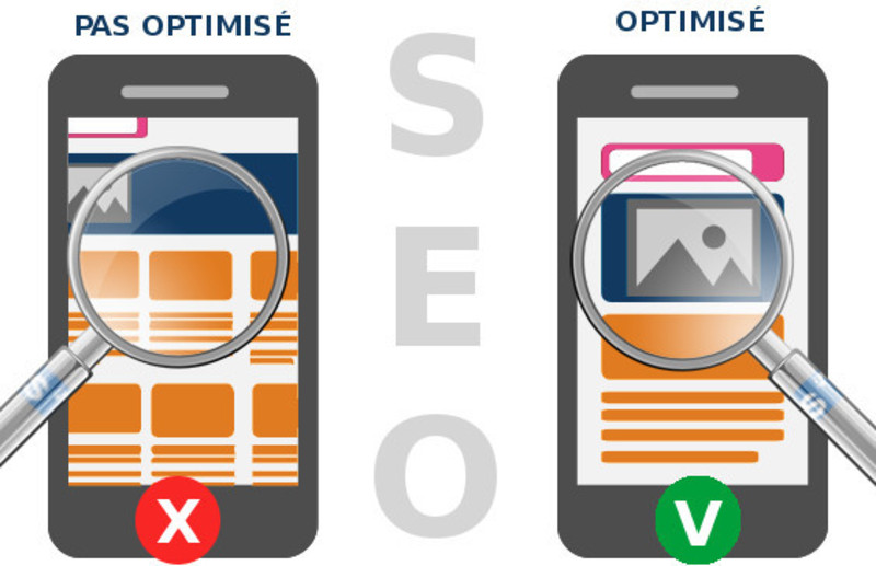
The current trend is increasingly focused on mobility. This is why more and more websites are being designed to adapt to all types of devices, including smartphones and tablets. These new browsing habits have also led Google to evolve its search ranking algorithms.
As mobile traffic has continued to grow, Google has increasingly prioritized “mobile-friendly” websites. This initially included the introduction of a mobile-friendly label in the SERPs (Search Engine Results Pages) and the use of mobile compatibility as a ranking factor. Websites optimized for different screen sizes and devices can therefore benefit from a better overall user experience and stronger search performance.
This evolution reflects the broader transformation of the Web. It has encouraged companies to optimize their websites for mobile devices, provide users with a better browsing experience, and make their content accessible across different types of devices.
Beyond accessibility, search behavior can also differ depending on the device being used. On mobile devices, users often spend less time browsing than they do on desktop computers and may have a more specific idea of what they are looking for.
If you want to maximize your website’s performance, it is therefore essential to provide the best possible experience for searches performed on both desktop and mobile devices. Remember that a well-optimized responsive website will always provide a better user experience than a website that is difficult to navigate or read on mobile devices.
You have probably already tried browsing a website that was not optimized for mobile devices and struggled to click on the menu or other links. With responsive web design, those problems are a thing of the past!
Responsive Web Design (RWD) is an approach that combines various web development and graphic design principles to create a website that automatically adapts to the size of the user’s screen.
It is designed to provide visitors with an optimal browsing experience, making content easier to read and navigate across all types of devices. The objective is to anticipate different screen sizes and provide a comfortable viewing experience on each of them through an appropriate website architecture and design.
The challenge is to minimize the need for horizontal scrolling or zooming in and out, as these actions can negatively affect the browsing experience.
A successful responsive user experience therefore requires minimal resizing, cropping, and multidirectional scrolling, ensuring smooth and intuitive navigation regardless of the device being used.
Google’s approach is not without reason. Responsive web design offers several significant advantages when it comes to SEO.
1. Make It Easier for Googlebot to Crawl Your Website
A responsive website can make crawling easier for search engines. Crawling is the process used by search engine robots to explore a website, understand its structure, and discover its content.
With responsive web design, the same content and URLs are generally used across desktop, tablet, and mobile devices. This makes it easier for Googlebot to crawl and understand your website without having to deal with completely separate versions of the same pages.
As a result, Google can more efficiently discover, crawl, and index your content.
2. Improve Your Visibility in Mobile Search Results
Google has progressively placed greater emphasis on the mobile experience when evaluating websites. A website that is properly optimized for smartphones and tablets provides visitors with a better browsing experience and can contribute to stronger search performance.
Responsive web design ensures that pages remain readable, accessible, and easy to navigate regardless of screen size.
Providing a high-quality mobile experience can also encourage users to remain on your website, explore additional pages, and interact with your content—all important factors for the overall performance of your website.
3. Avoid Duplicate Content
If you choose not to use Responsive Web Design and instead create a separate mobile website alongside your desktop website, content and URL management can become more complex.
A Responsive Web Design (RWD) approach is generally simpler because the same website, URLs, and content are used across all screen sizes. The layout automatically adapts according to the user’s device.
This helps consolidate your content under a single URL structure and reduces the technical complexity associated with maintaining separate desktop and mobile versions of your website.
4. Preserve Your Link Equity
The comparison between responsive design and a separate mobile website also has implications for your SEO strategy.
Creating a separate mobile version can require managing different URLs and additional technical SEO configurations. Responsive web design, on the other hand, allows you to maintain a single website across desktop, tablet, and mobile devices.
Your backlinks, social mentions, and other external signals therefore point towards the same URLs rather than being divided between different versions of your website.
Ultimately, responsive web design helps consolidate your link equity and supports the overall SEO performance of your website across all devices.
1. Different Search Queries on Mobile
When using a mobile device, users often perform more targeted searches than they would on a desktop computer. Mobile searches are frequently driven by the need to find information quickly, whether to make an immediate purchase or find practical information.
Search queries can also be highly influenced by the user’s location, particularly for local searches. This is an important aspect to consider in your SEO strategy. Your keyword strategy should therefore take into account the different search intentions and behaviors of both mobile and desktop users.
2. Optimize Your Title Tags for Mobile
Pay particular attention to your title tags. On mobile devices, the space available to display search results is limited, meaning that long titles may be truncated.
Rather than focusing exclusively on a specific number of characters, make sure that the most important keywords and information appear towards the beginning of your title. Your titles should remain concise, relevant, and attractive on both mobile and desktop search results.
3. Pay Attention to Page Loading Times
Page loading speed is particularly important on mobile devices. A responsive website may sometimes load unnecessary resources if certain desktop elements are simply hidden using CSS rather than being properly optimized for mobile.
These unnecessary resources can increase loading times, especially when users are browsing with a slow or unstable mobile connection.
Page speed is an important factor for both SEO and user experience. Depending on the importance of mobile traffic for your website, adopting a mobile-first approach can therefore be particularly beneficial.
Mobile-first development means designing and developing the website for mobile devices first, before progressively adapting and enhancing the experience for larger screens such as tablets and desktop computers. This approach can help create lighter, faster, and more efficient mobile experiences.
Here is a list of additional solutions that can help you take your mobile SEO strategy even further with a responsive web design website:
1. Create Mobile-Optimized Landing Pages
Creating landing pages with content specifically optimized for mobile users can help you better address mobile search intent and local searches.
These pages should focus on providing a fast, clear, and relevant user experience rather than simply duplicating existing content. By tailoring content to specific user needs and search intentions, you can improve the relevance of your pages and generate more qualified traffic from mobile and local searches.
2. Adopt RESS (Responsive Web Design + Server-Side Components) to Improve Website Performance
Some development teams favor a client-side approach, while others prefer server-side solutions. RESS (Responsive Web Design + Server-Side Components) combines both approaches to provide a more optimized solution.
RESS can significantly improve the performance of websites built with responsive web design. The technique detects certain characteristics of the device being used and allows the server to deliver only the resources required for the relevant experience, such as images, HTML content, or JavaScript files.
By avoiding the unnecessary loading of resources, this approach can significantly reduce page loading times and provide a faster, more efficient experience across desktop and mobile devices.
Responsive web design offers significant benefits in terms of SEO. Optimizing your website for mobile devices is therefore an essential step in improving your search visibility and avoiding a negative impact on your performance.
In terms of figures, since April 28, 2015, websites that were not compatible with mobile devices experienced 5.3% lower visibility in Google mobile search results compared with desktop searches. This highlights the decline in visibility experienced by websites that were not considered mobile-friendly.
They trust us